9 Things To Follow To Create The Perfect Landing Page - As Instructed From The Conversion Code
Key elements to making a killer landing page
Reading has always been a major hobby of mine, and as I design more and more landing pages, it has become second nature for me to naturally recall the key elements perfectly describes in the book “Conversion Code”. Today I wish to provide to our readers who may be building their own landing pages a few general rules and guidelines as it was mentioned in the book.
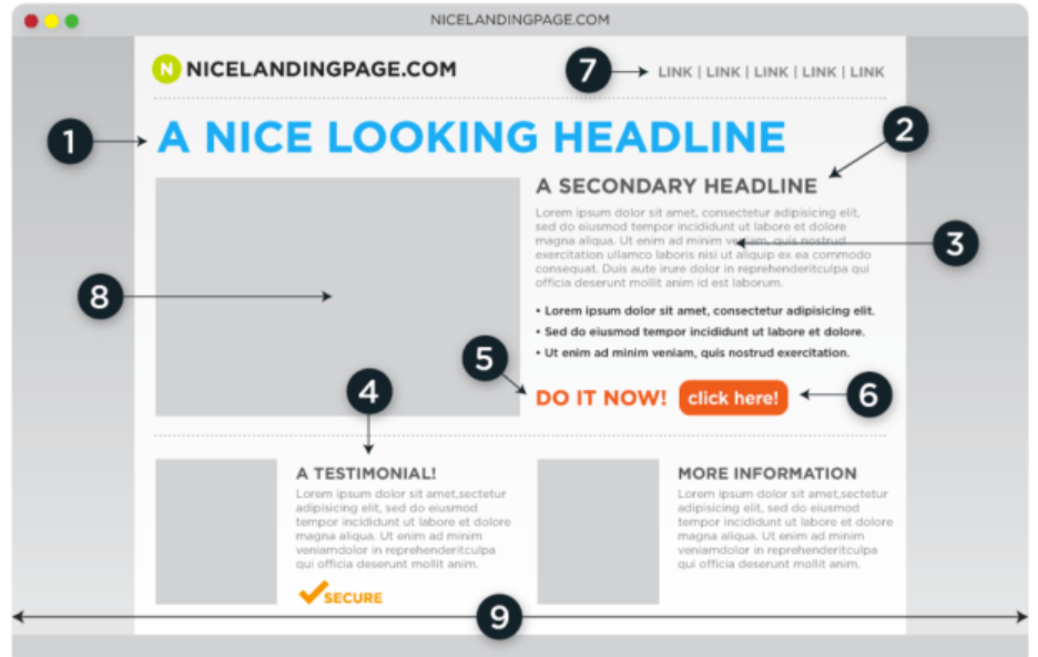
1 Head line
Needs to be clear, obvious, and relevant to the ad or title of the redirection source that has guided your traffic to the landing page. The objective of the headline is to ensure the lead that they have been redirected to the correct place they need to be. Statistically, new visitors only have about 8 seconds of attention, so try not to get too fancy.
2 Sub headline
The goal of the sub headline is to guide your readings downward to the meat and potatoes of the page. Often this is a hook or incentivized offer to push the visitors to stay. “Free Checklist To Build A Landing Page” “Increase Landing Page Visitor Retention Now” are both good examples of how one would keep a visitor.
3 Description
Make sure to comb through all of the spelling and grammar of the text including punctuations. Check every line of text through a detective lens, with everything being published. Being unable to talk to potential new customers, words are your tool. So make sure they are at the very least correct.
4 Testimonials
If you already have results, testimonials are great ways to establish trust very quickly. Using positive reviews will also accredit your business and break down the wall of skepticism from your visitors. Even accreditation or experience are great testimonials. Keep in mind that every purchase is bought with the trust that the good or service will be delivered.
5 Call to Action
The call to action must be visible, easy to find, and ready whenever the visitor has made the decision to continue with the conversion. For the button, avoid using “Register” or “Subscribe”, instead try less action or demanding phrases like “View Now” or “Unlock - Free”. Be creative and don’t be afraid to test!
6 Buttons
It is advised to have the conversion button a bright and easily noticeable button. Most importantly, make sure the button is located above the breaking line so the readers do not need to scroll to find the button.
7 No Misdirection
Landing pages should and only be single purpose pages. There should not be any other things that will misdirect or distract the visitor. Having other buttons or links to your home page are examples of potential misdirection, defeating the purpose of a landing page. Keep in mind that landing pages are NOT your website, they are to gather leads.
8 Image or video
Have captivating media content. Think about as you scroll through Instagram or Facebook, what kind of image has the stopping power? At Local Spear Leads we gear towards a single captivating picture or video instead of a collage. If you do not have any readily available media content relevant to your landing page, there are many free stock images available online such as Stock-Up or Pexels.
9 Stay Above the Fold
Since many of the visitors may also be visiting from their phones, it is important to keep the best of the converting content visible without having to scroll on the phone.
With this I wish your readers have a general understanding of how a landing page is best designed and have greater success finding leads! If you have any additional questions,
contact us for a free evaluation of your landing page or submit a inquiry to let us help you build one!


SPIN Selling 101 Features vs Benefits: How To Identify Them And Write A Simple Compelling Sales Copy